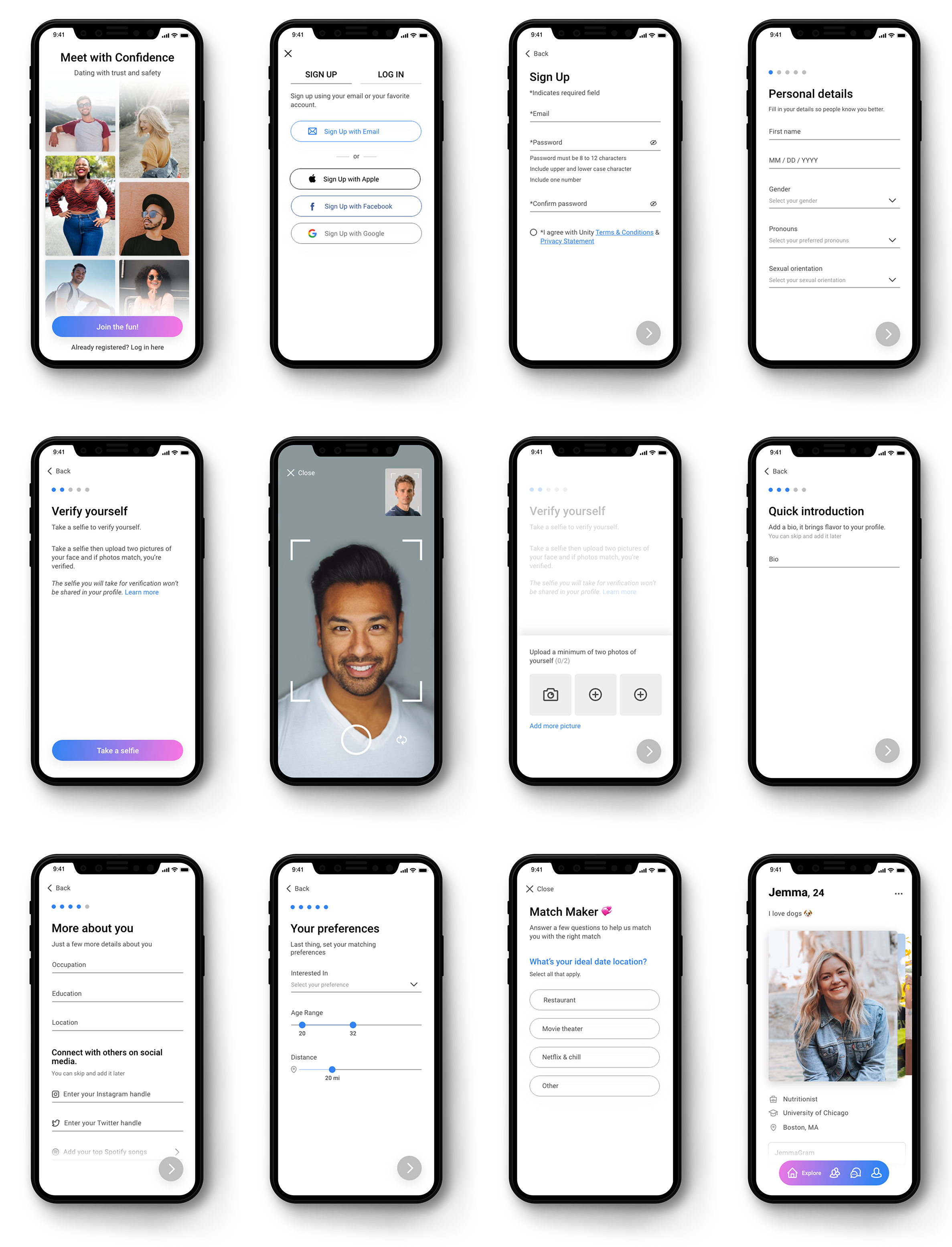
An online dating app that provides a safe environment to users by providing an image validation step in the sign-up process to eliminate potential frauds and scammers from creating profiles.
Case Study: UX Design
The problem
Online dating provides the convenience and ease to get to know someone before actually meeting, but it does come with a range of issues and concerns including scamming, catfishing, and in some extreme cases of danger.
Going into this project, I wanted to approach it from a design thinking perspective to help me explore and learn more about safety in online dating and gather insights to help understand the issues users face. I began by exploring the relationship between user behaviors and experiences within online dating platforms.
Research
User Interviews
Goal: To get a general understanding about users experience in online dating apps and gain insights on the safety aspect of it.
Participants: College students and working professionals aging in range from early 20s to late 30s. All came from different ethnicities and cultural backgrounds.
Methodology: I interviewed participants who are active or were active in online dating. The interviews took approximately 30 minutes and I asked questions about their online dating experience. Some of the questions I asked:
What dating app are you currently using?
Are you using more than one dating app?
Have you met someone from a dating app before?
Ever felt unsafe or uncomfortable while chatting with someone you matched with?
Key Findings
I conducted an affinity diagramming exercise about safety in online dating. Through affinity mapping, I was able to organize research findings and organize related facts into distinct groups and clusters.
After mapping out the data from the interviews, I was able to get a better understanding and combine the information into different categories.
Privacy: Some of the participants expressed that they prefer to not share their social media accounts in their dating profile because they don’t feel comfortable to share too much about themselves to strangers.
Other participants I interviewed expressed that they prefer to match with individuals who share their social media accounts (such as Instagram or Facebook) in their dating profile. Through other social media accounts, users can find if there’s any mutual connections between each other.
Safety: 3 out of the 4 participants experienced some type of catfishing, scam or threat in an online dating app. One participant mentioned a previous experience that impacted their trust in matching with other people in dating apps.
Communication tools: Most of the participants I interviewed expressed the lack of desire to use certain communication features such as video chat or audio calls when communicating with individuals in a dating app. One participant expressed that video chat can be overwhelming especially when it is with someone they don’t know.
After synthesizing all the data from the interviews, 2 personas ultimately emerged.
Competitive Analysis
Through competitive research, I examined both direct and indirect competitors to understand the features and services available in regard to the safety of the users.
Most of the applications lacked an authentication feature, users are not required to be authenticated.
Online dating connected with Social media such as Facebook Dating was not popular among young users. Mobile applications are preferred more than websites or other services.Random messaging was not desired, users prefer to engage with individuals only if they match.
Trust is Key!
By creating a dating app that provides an identity authentication step in the sign-up process, we will eliminate potential frauds and scammers from creating profiles.
Ideation & Design
Through self-validation in the sign-up process, users can feel confident and safe while interacting with other users.
Users can take a live photo through the app and then the user uploads two selfies where facial recognition will allow the app to compare the live photo with the two uploaded selfies and validate if they match.
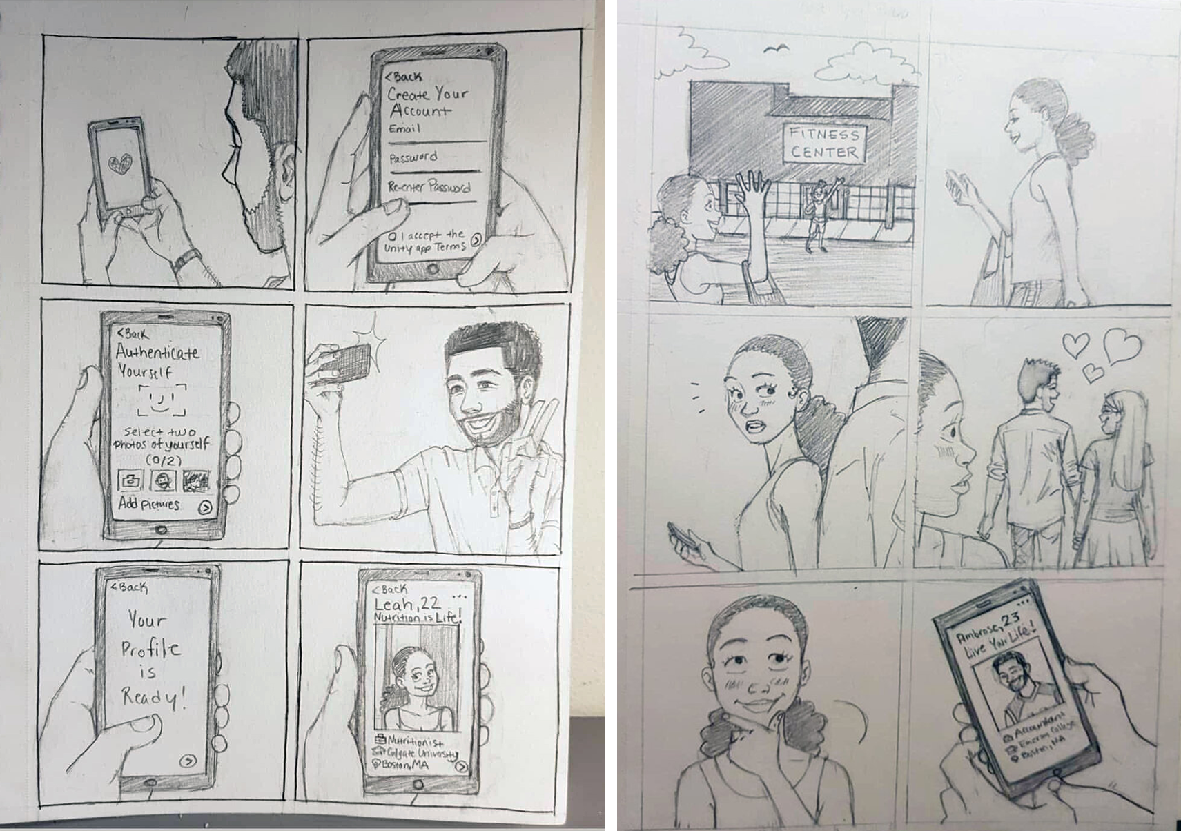
illustrated user journey through sketched story (Sketches by Alexandria Clere @akclere)
Since the user will interact with the authentication process early in the app experience, the instructions should clear to guide the user through the journey.
Information Architecture
I recruited 3 participants and conducted an open card sorting exercise to see the effectiveness of the wording, descriptions and sections of the authentication instructions. I asked participants to think out loud and walk me through their thinking process and thoughts as they grouped cards together and put them in categories.
Low-fidelity Wireframes
I sketched lo-fi wireframes and conducted user testing via Marvel App
Usability Testing
Problem: When given the task to create an account and go through the authentication step, users wanted to see the instructions during the process of taking a selfie.
Solution: By removing the instructions and placing guides on the screen while taking a selfie eased the process for the user.
Problem: When given the task to create a personal profile, users wanted to track the progress and what was left before completing the task.
Solution: By adding a progress bar and combining related information in a single screen eliminated the issue.


